ZOOM IN.
ART ON THE WILD SIDE.
6.30.2010
Stair


Stair
Puah Hui Sze
Photography
2010

This is a photo of a portion of stairs in a boat cruise. I went for a cruise trip around the straits of Singapore. I really like this flight of stairs; hence, I took this photo when I was coming down from the second level of the boat cruise. There is a sense of movement in this photo due to the perspective in which I took this photo from. This is because the stair seems to be very steep, as though someone is sure to fall if he were to be on this stairs. I chose to take from this perspective as it is more exciting for viewers to take a look at what it looks like at the instance when one is falling from a height. This photo successfully captured that fleeting moment when one is about to fall, with clear defined forms. In this photo, I captured a portion of a man's legs at the top left hand corner. This was actually inspired by Edouard Manet's artwork, Bar at the Folies Bergere. Manet painted an acrobat's pair of legs at the top left hand corner to puzzle and mystify viewers, giving them something to ponder about. This was why I employed Manet's brilliant technique to intrigue viewers further, like there is actually a man waiting at the end of the staircase...
Wild Thing

Wild Thing


Puah Hui Sze


Clay, silica paint


2010

This is one of my works for this year's assignment. This is a monster made from clay. It is an incense burner that one uses for aroma therapy. This monster has hair that is rotten, which are actually Rafflesia's petals. It has a slimy and old body in a sickening shade of green. The inside of its mouth is magic blue, and has a relatively smooth surface. The dish used for containing plant oils has a tiny, sad but bloody grey bunny in it. I wanted to make my Wild Thing as scary and gruesome as possible, maybe even gory. Hence, I drew one hole into each of its eyes, so that when the candle is lit, light can be seen shining throug its eyes. To make the eye look catchier, I carved simple designs that look like eyelashes. The colour combination of the Wild Thing was inspired by Paul Gauguin's selection of primitive colours, but primitive colours chosen by me were quite muted. The choice of colours for my Wild Thing was also due to the habitat of this Wild Thing--jungle.
Swan


Swan
Puah Hui Sze
Origami papers, glitter glue
2010
This is a 3-dimensional art piece of a swan. The swan is multi-coloured and some feathers have glitter on them as embellishment. This swan is colourful as it represents our group's art, full of vibrancy, brilliance and colour. This swan is something like a Lego built structure and it was painstakingly made by using folded paper parts joined together. Therefore, it means that every effort made, be it little or big, is of great importance to the final success of our group's exhibition. Though this swan was made after failures, the final product is still a success. Failures and difficulties were also what we experienced when doing our very own magazine. Thus, this swan is considered as a personification of all our hard work and a literal representation of our fruit of labour.
6.29.2010

Family

Puah Hui Sze

Pencil, coloured pencils

2003

This piece of artwork is a portrait of my family on a bridge. The background is a blue sky, with white clouds, two birds and an aeroplane. The colour of the sky was coloured lightly using light blue. In the foreground, there is a wooden bridge on the grey pavement. This bridge is actually the one in my uncle’s condominium in Choa Chu Kang. I had some difficulty in drawing the curve of the base of the bridge, thus, the arc drawn was not smooth. The form of the bridge is defined, but the colour is flat, hence, the bridge is more 2-dimensional. The pavement appears to have a rough texture as I coloured the pavement using different amounts of strength, to make darker tones of grey at some parts on the pavement. In the foreground, there is a grass patch and a portion of pond drawn. The grass patch was made up of strokes of various shades of green, giving the effect of solidity. The animals in the pond are engaging in their activities. I drew speech bubbles and thinking bubbles to show even more clearly on what the animals are doing. The animals also appear flat as the colours were untreated and there were no colour gradations.


Fruit Basket

Fruit Basket
Puah Hui Sze
Pencil, coloured pencils, markers, glitter glue
2003

The subject matter of this artwork is 2-dimensional, with bright and vibrant colours in domination. The fruits in the basket were my favourite fruits then, and the colours were flat and not spread out properly, leaving white patches, thus, look unfinished. The basket was decorated mainly with patterns. This was my very first attempt using patterns in my artwork. I used stars to decorate the body of the basket, circles and squares on the rim. The designs of the ribbons were simple shapes. The handle of this basket was decorated with zigzag lines. The colour combination in this artwork is rather suitable and colours chosen complemented each other. However, the outlines of forms are not smooth and well defined, as they are fuzzy and uneven. In the background, there are balloons, thus, giving a festive-like feeling when viewers look at this artwork.


Going Home

Puah Hui Sze

Poster paint, pencil

2005


In this piece of artwork, there are patches of colours with different patterns. These patterns were made using wooden chopstick to draw on wet poster paint. This piece of artwork is quite different from all the artworks I have done. This was considered as a daring attempt. This is because I only used sponge to dab on the fresh-the-tube poster paint and applied directly onto the drawing paper. After that, I used a wooden chopstick to create patterns on the wet paint. The final dab of coffee brown was portrayed as a house, and the pther dabs f paint represent the path back home. Each step is unique on its own, with varying patterns. I used my finger to paint the pond, to give the unfinished texture. The two ducks are complementary to the pond as the forms of the ducks are not detailed and refined. The colour of the ducks is also rather flat. To make the grass look alive, I used a comb, dip it into green poster paint and used the comb to stroke on th edrawing paper. It gave a unique effect and the tones of green varied, giving the grass its form. This artwork's simplicity is what makes it the striking one.
6.28.2010
Photoshoot: Flare for Fuchsia


Flare for Fuchsia (Fashion Illustration) [Above Left]
Grace Chong
A4, Pen, Marker
May 2010

Flare for Fuchsia (Dress) [Above Right]
Grace Chong
Dress, Cotton, Boning
June 2010

"Flare for Fuchsia" is also another dress I designed and made for the collaborative work together with Jubilee, Hui Sze and Tze She. The photoshoot picture will be featured on the magazine, Zoom In, which we will be producing.

"Flare for Fuchsia" is similar to "Sleek Silver with Lace" in the way that they are both tube dresses. However, "Flare for Fuchsia" has a flare skirt, and is more simple. It is a fuchsia-coloured dress, made using cotton. It has no contrast in colour and texture, hence making it very simple. The dress is symmetrical in shape, and balanced. The colour of fuchsia dominated the composition of the dress, and there is little sense of movement in the dress, as there is no unusual feature in it.

Again, I have used boning to emphasize the fitting of the bodice to the body. The material used - cotton, is not very shiny, hence keeping the dress as simple as possible. The simplicity of the dress, is what makes it beautiful and unique. This adheres to my intended message, "Simplicity is Key". With a few accessories, here and there, the dress will shine.
Photoshoot: Sleek Silver with Lace


Sleek Silver with Lace (Fashion Illustration) [Below]
Grace Chong
A4, Pencil, Markers
May 2010

Sleek Silver with Lace (Dress) [Right]
Grace Chong
Dress, Satin, Boning, Lace
June 2010


This is a tube dress I designed known as "Sleek Silver with Lace". This dress will be used as a collaborative work together with Jubilee, Hui Sze and Tze She. The picture beside is a Fashion Illustration of what I will create. As for the photoshoot itself, the picture will be featured on the magazine, Zoom In which we will be producing although I have taken a picture of the dress itself, which I made (shown above).

"Sleek Silver with Lace" is a tube dress fitting to the body, made up of silver-coloured satin and some lace at the waist area of the dress. I made use of little contrast of colours this time so as to make the dress look more formal, as it is intended to be (worn during formal dinners and events). The different texture used will be the lace and the satin itself. I only chose one dominating feature of the dress - lace, is because I wanted to keep minimum eye movement and let the viewer's eye to be attached to only the lace and the silk material. This also contributes to my current message being conveyed through this dress,"Simple is Key".

On the dress, I have used boning in the lining, to create form on the dress, making it more fitting and flattering to the body. The dress is kept simple, conveying my idea, "Simple is Key".


Bohemian Rhapsody

Bohemian Rhapsody
Grace Chong
A4, Pencil, Marker
June 2010

"Bohemian Rhapsody" was inspired by the song sung by Queen. Then, I designed this tunic dress. The flowery patterns on the dress are a reminder of happiness, like rhapsody in "Bohemian Rhapsody".

"Bohemian Rhapsody" is a short dress for women to wear for shopping or for a stroll in the beach. It has flowery-like prints, which are radiant and fun.

I used pencils and copic markers to draw it. The dress is made from cotton with tie-dye, thus creating many bluish-white spots, similar to many flowers clustered together, like poppies. In this dress, not much contrast in colour and textures is used, as the dominating feature of this work is the pattern on the dress.

The pattern on the dress is similar to choppy brushstrokes. My intention of making my patterns like choppy brushstrokes is to create an impressionistic look. I was influenced by the Impressionist, Claude Monet's style of painting, and I designed a dress based on his ideas combined with mine. I wanted to use art history in fashion design. By designing such a dress, I have conveyed my message, that clothes can have painting styles like Impressionistic features to it, and I think I am successful in conveying this.
Blush with Edge


Blush with Edge
Grace Chong
A4, Pencil, Marker
June 2010

"Blush with Edge" was designed specifically for a celebrity to wear to the red carpet. The reason for this name is because of the gown's colour. It is pink, similar to a blusher, a lady puts on to her cheeks. The colour is sweet and pretty, able to make people who see the lady in this gown blush, but with edge, referring to the sudden black in the gown.

"Blush with Edge" was inspired by the idea of corsets and designed by me a few months ago during my free time.

I was fascinated by how corsets could define a woman’s figure, though harmful. Wanting to design a dress which screamed "corset" in it, I designed a bustier gown, using pencils, and markers on A4 drawing block paper.

This dress is made of blush coloured satin. It fits to the body closely, until the knees, where it protrudes out, similar to a fish’s tail, a recognizable shape in the dress. The black lines on the dress are made of satin which link the different parts of the dress together. The black is contrasting to the sweet blush, which gives the gown a less feminine feel.

Through this dress, I want to convey my idea of gowns can also be edgy through contrasts in colour. I do think I am successful in conveying this message.
Amore

Amore
Grace Chong
A4, Liquid Paper, Pencil, Felt Pen, Marker
December 2009

“Amore” is "love" in Italian. This is a wedding dress, worn in a wedding. Therefore, a wedding dress is also part of the celebration of love, thus, I called this fashion illustration, "Amore".

This fashion illustration was drawn using liquid paper, pen ink, and zig markers. I used liquid paper to colour the entire gown, so as to give a little bit of shine, like the intended fabric I want to use for this gown - white satin. For the top of the dress, I used pen ink to draw the patterns. Then, I placed liquid paper on top of that area and use my fingers
to smudge the liquid paper, giving a soft effect to the fabric.

These patterns are to be hand embroidery with chiffon sewed on top with the embroidered satin. Chiffon and satin have contrasting textures, thus, by using them, the gown will seem to have more variety.

The outstanding feature of this artwork will be the embroidery on the bodice, as the rest of the dress is plain white satin. The dress will be made to have a balanced form.

This work symbolizes the day when a girl will look the most beautiful in her life. The embroidery represents the many blessings she will have. I do not think I am successful in conveying this idea.
Dakota's Dress

Dakota's Dress
Grace Chong
A4, Pencil, Colour Pencils
2009

I call this work “Dakota’s Dress” as I was inspired by the style of Dakota Fanning’s dressing and the gothic and vampirish looks, I wanted to come up with a dress that incorporated goth but yet could be worn by anyone, to a formal dinner or even by a celebrity to the red carpet. Hence, I designed this dress.

It is a dress with a corset-like bodice with boning in it made of black satin. As for the puff at the skirt, I was thinking of pieces of black organza crumpled together and sewed on top of the satin, creating that volume. I think that this dress is not to gothic and can be worn by anybody to a formal dinner. The recognizable shape would be a clipped poodle. There are contrasting textures - the satin and the crumple organza. The dress is symmetrical in shape.

I wanted to convey my vision that goth can be transited to a whole new level - with a sweet and feminine edge to it. With this dress, I feel that I am successful in conveying this vision.
The Vase with the Fish

The Vase with the Fish
Grace Chong
Clay
2008

A vase, beige and green in colour. Both colours, found on the muddy ground, the forest, the soil, our Mother Earth.

The fish, another symbol to our lives. Our food, found in the rivers and streams, seas and oceans, our Mother Earth.

The Vase with the Fish, a representative of the preciousness of Gaia, Earth.

The Vase with the Fish, another representative, but of tribal life. The rough textures are the hardships tribal men went through, and the smooth glaze, the glory they have experienced.

Yes, The Vase with the Fish, a true example of Tribe People and Earth.
The Bowl

The Bowl
Grace Chong
Clay
2006

Two colours.
Two emotions.
Too uneven.
Too different.

This bowl is not like any
other bowl. Though it is circular in shape and made of clay, the two contrasting colours on it, namely sky blue and dark pink, with different textures, smooth and rough at different parts, creates a mixture of emotions like calm yet emotional, thus making The Bowl different. Everything is mixed.

Different textures, together in one.

Contrasting colours, mixed up.

Warmth, yet with coolness.

Happiness, with sadness.

Does this not mean, that things all come in mixed emotions and points?
6.26.2010
Rural Village

Rural Village (2010)
Photography

This photograph shows a row of old shop houses in front of the central pond of a rural village. An old man is pulling a cart along the pavement in front of these shop houses. It was taken at Hongcun Village in Huangshan city, China.

This photograph shows the humble ways of the villagers in this village, which has now become one of the countries’ cultural heritage sites. It depicts the traditional Chinese houses in the background as well as the central pond in the foreground, which is used by the villagers for their daily activities. The man pulling the cart is also a good example of how the villagers still retain their traditional practices that were used in the past by their ancestors despite the rapidly changing world around them. Till today, no cars are allowed to drive into the village and the villagers depend on horses or very often only their own two feet to ferry them around.

Labels: , , , ,

Rocks amongst clouds

Rocks amongst clouds (2010)
Photography

This photograph shows a stalagmite rock formation in the midst of a sea of clouds, framed by the leaves of a pine tree on the right. It was taken at Monkey’s Peak in Mount Huangshan, China, in the early morning about an hour after sunrise.

Due to the timing that the photograph was taken, there is still a bluish tinge to the whole scene, which is actually the effect of light of the half-risen sun. The clouds are floating between the valleys of the rock formations in the distance, and appear to be like a ‘sea’ of clouds. On the large rock on the extreme left, the rock formation on top of it appears to be that of a monkey gazing down at the sea of clouds beneath it, which gives rise to the name of the peak this photograph was taken from.

Labels: , ,

Sunset in the Horizon

Sunset in the Horizon (2008) A3, Poster Paint


This artwork is an abstract art, which shows a sunrise scene in the horizon and a bench beneath a tree with a few people sitting on it. It was done using poster paints and inspired by the artwork “Impression - Sunrise” by Claude Monet, leader of the Impressionists movement.
Evidence of the Impressionists’ style is the use of bright colors as well as the unfinished look of the painting. Swift and broken strokes of color are also regularly used in the artwork. This is especially evident in the strokes of white on the surface of the water, which serves to portray the shimmering effect of light on water, yet another evidence of Impressionism.

Forms are depicted by colors instead of lines, which appeal more to the viewer’s sense of sight. They are also reduced to its simplest shapes so as to preserve simplicity and originality in this work of art. The use of bold brushstrokes is employed throughout the artwork. Overall, the composition of the artwork seems to be balanced.

Labels: , ,

Eager Frog

Eager Frog (2009) A4, Pencils

This sketch shows an eager and alert frog balancing precariously on two plant stalks, which intersect each other diagonally. It was done using pencils of different thickness.

There is a dominant use of curved lines to create the shape and form of the frog as well as the plant stalks, such that a sense of movement along the lines of plant stalks is created. The form of the frog is also enhanced using intricate shading, thus creating a sense of visual depth and three-dimensionality. The composition of the artwork is quite balanced due to the fact that although the frog seems to be drawn mostly on the right, it is leaning towards the left.

Labels:

Eagle on a Rock
Eagle on a Rock (2009) A3, Poster Color


This artwork shows the side view of a colorful eagle standing on a rock in the middle of the ocean with the sunset in the background. It was done using poster paints with a mixture of warm and cool colors used.

This artwork reflects the Impressionists style with the bright and colorful palette used for the eagle’s body, which seem to make it stand out more as compared to the background. The eagle also appears to be three-dimensional through the use of different tones and of carefully blended color. The composition of the painting is fairly balanced.

Another evidence of the Impressionists style is the lack of realism in the artwork in terms of the colors used for the eagle and the sunset. Swift and broken brushstrokes are also applied in impasto style for the background as well as the feathers of the eagle, which are made obvious by the swift brushstrokes of pure white at its chest. The eagles’ eyes also give a look of alertness and curiosity; similar to that of an animal that has just spotted its prey.

Labels: , , , ,

6.10.2010
5: Blessing In Disguise
A Blessing In Disguise (Jan 2010)
Photography
3648 x 2736

Remember those days when you're walking in a park when it's all quiet, and you're looking into the water and you see the reflection of the clear blue sky. Just when you were thinking: It looks beautiful, something crashes into the water, causing a disturbance, and that image you were once marvelling at suddenly shatters.

Then, you look closer, and you realise. The ripples are dividing themselves continuously, at times clashing softly into the other ripples in the water. With the ripples in the water it looks even more beautiful. Isn't it simply a blessing in disguise?

My purpose of taking this picture was to was paint out a scenery that seems to move slowly with time as the viewer takes it all in. In this picture, I also exploited the amazing quality of the water to be able to reflect an image, to compare it to a mirror, something broken rather easily, like how the "something" crashed into the water, breaking apart the peaceful image before.

Labels: , , , , ,

4: éclatement de fleurs
éclatement de fleurs (2010)
Photoshop
A4

"Eclatement de fleurs" means "flower burst" in French. I decided to name it in French because it the sound of the title in French sounded more smooth, and the word "burst" would sound too harsh. I wanted the graphic to have an effect such that the viewer can feel the petals shooting out from one flower, and that the petals are going to fall around them causing time to stop almost immediately.

The original pictures of the flowers were taken when I went overseas, and when I found these pictures again, I wanted to use the brilliant colours to bring out the title of "flower burst". It is basically a collage of flowers done on Photoshop, but I played around with the images' transparency, size and colour to form this image. I think that this artwork could possibly be used in a commercial advertisement, perhaps in the area of advertising for a new scent or perfume.

- Jubilee

Labels: , , , , , ,

3: Sheer Beauty (2009)
Sheer Beauty (2009)
Felt Pen, COPIC Markers
A4

I was first inspired by a sheer Alexander Wang dress I came across in a magazine, as shown below. I wanted to design something like it, something daring, sexy and yet so high fashion at the same time, but I wasn't used to the idea of an entirely sheer dress last year, so I decided to go with something more conservative.
I used the same concept of employing velvet streaks to create a pattern to cover the breast area. My design was symmetrical, compared to the asymmetrical deign done by Alexander Wang. I also liked the idea of sheer sleeves that would show off the wearer's arms without having to go sleeveless. I created a more feminine look that was more sweet-looking. The bottom area of the dress is generally a bluish-purple bubble skirt that is meant to be more slim at the torso area and only "bubble up" more at the bottom of the dress.


http://cdni.condenast.co.uk/1280x1920/Shows/SS2009/New_York/R-T-W/Alexander_Wang/00150big.jpg
-Jubilee

Labels: , , , ,

2: A Tale Of Two Sisters (2010)

A Tale Of Two Sisters (2010)
Felt Pen, COPIC Markers
A4 per drawing

There isn't really a tale behind these two, except that they are rather much opposites, and I made use of the complementary colours, green and red, to show that despite their differences, they still are very close to each other as sisters.

The red dress makes use of a lot of volume and the contour lines I drew at the bottom are to suggest the sweeping movement of the skirt. I got my inspiration for the skirt from a cocoon---the way it is wrapped up so carefully in a distinctive shape. It is a off-shoulder dress that shows off some skin at the waist area. I would use chiffon and satin to make this dress.

The green dress is more flowy and it is a toga dress with a triangular hole at the back of the dress to show off the wearer's back nicely. A bulk of volume is then concentrated at the top of the skirt area, and the rest of the skirt is more flowing. I would make use of organza and jersey to make this dress.

Both dresses make use of scallop sleeves.
-Jubilee

Labels: , , , , ,

1: Purple Romance (Couture) [May 2010]
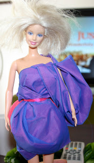
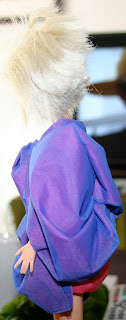
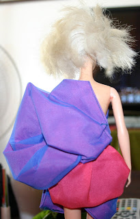
Purple Romance (Couture)[May 2010]
Organza, Cotton, Ribbon

I used one of my old Barbie dolls in order to sew this couture mini-dress. My inspiration for this dress was basically the shape of a rose.I layered blue organza over the bright pink cloth, and I also used pink ribbon to enhance the waist. The colours and the sleeve give the
dress a more romantic look.

I was also partially influenced Karl Lagerfeld's theory of "butterfly sleeves". His description of the "butterfly sleeves" are as quoted from him:

You saw the way they are not completely attached, so you can move and there is a volume that's why I call them butterfly or flying sleeves.
In the same way, my toga dress made use of the same concept of the butterfly sleeves.

This dress is my favourite piece of work so far, as I find that it is one of the most well-made and really speaks to my fashion sense a lot, being my first attempt to sew a proper dress for a doll using a sewing machine.

P.S. Do not copy!!!
-Jubilee

Labels: , , , ,